Client
Jenny Truong
Complete Date
March 27 2020
Category
Web Design
How?
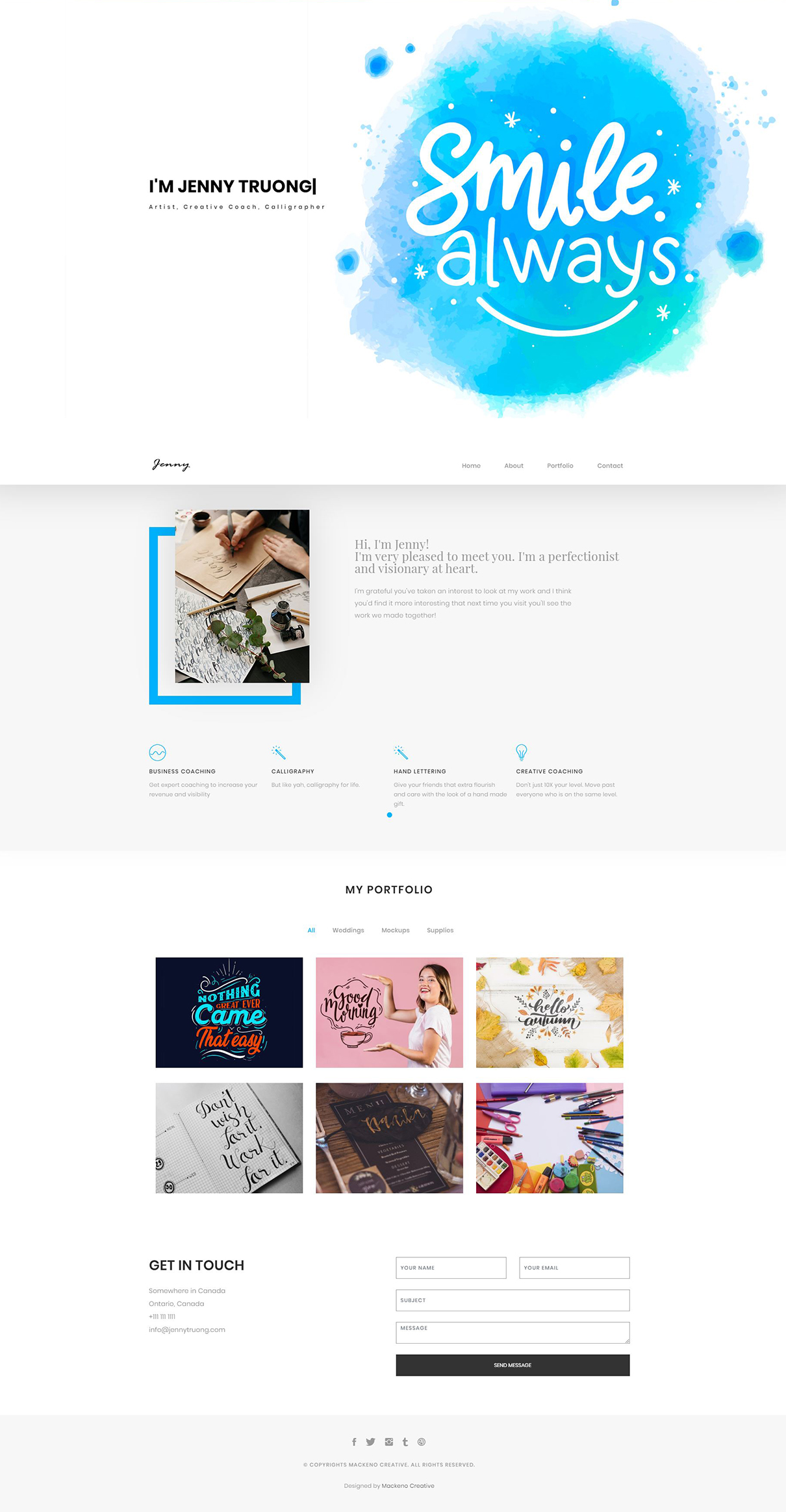
I knew I needed to appeal to the side of Jenny where she designs beautiful minimalist designs and also adds an individualistic personalized touch to everything she creates. I wanted to portray that same aesthetic to make her brand appearance.
That is how I came up with the idea to add in a flair of having the text constantly change between the plethora of things she does to make things unique. A large display banner that doesn’t crowd the area and provides supple negative was chosen because it blends in with the clean and polished aesthetic that she gives off and blends in with the rest of the website. I didn’t want to add too many elements to the website because many of her art works have breathing room and I wanted that to be represented in the website as well.
Features
- Dynamic Text Rewrite
- Mobile Responsive
- Sorting/Grouping Functionality
- Easy Contact Form
- Clickable Contact Buttons
- SSL Encryption
Why?
I chose to work on this project because I wanted to find a way to work with other creatives. I was very excited for this opportunity like many others because I believe it is a blend of crafts to not take over but to amplify and synergize art forms. The project worked out very well because of the minimalist appeal that she also embodies in her work.
Challenges?
- The first challenge of mine was to determine how to structure the content and let it flow naturally.
- Learning how to add in new code to dynamically rewrite her name.
- Color Psychology is very important to me. I wanted to convey her professionalism and build calmness when going through her website.